What is guided selling?
Guided Selling is a process in sales that helps potential customers choose a product that best fits their requirements. Generally speaking, guided selling can use different methods to guide the customer along, and it’s often supported by software or other tools.
In SaleSqueze, Guided Selling is implemented as a set of steps that guide the prospect to the product that fits their specifications and wishes. Once they are led to the chosen product, they can use the configurator to customize their ideal product.
What are the benefits of guided selling?
Using Guided Selling can ensure that customers get a streamlined and user-friendly purchasing experience. Since they are guided through the process, they don’t have to waste time searching for suitable products, and you’ll save them the frustration of looking at products that don’t suit their needs.
When should you consider implementing Guided Selling?
Guided Selling is a good idea if you have many different products, product lines, or if your products can be grouped using dimensions like size or usage. For example, if you’re selling RVs, vehicle capacity could be a good categorization to use in product selling.
Depending on each specific business, Guided Selling could have one or multiple steps. We find that in general, keeping to 1-3 steps of guided selling makes the best user experience.
Setting up Guided Selling in SaleSqueze
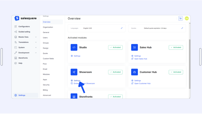
To use Guided Selling, you’ll need to enable this component in the Showroom settings. Go to Settings, then click on ⚙️ Settings under the Showroom module.
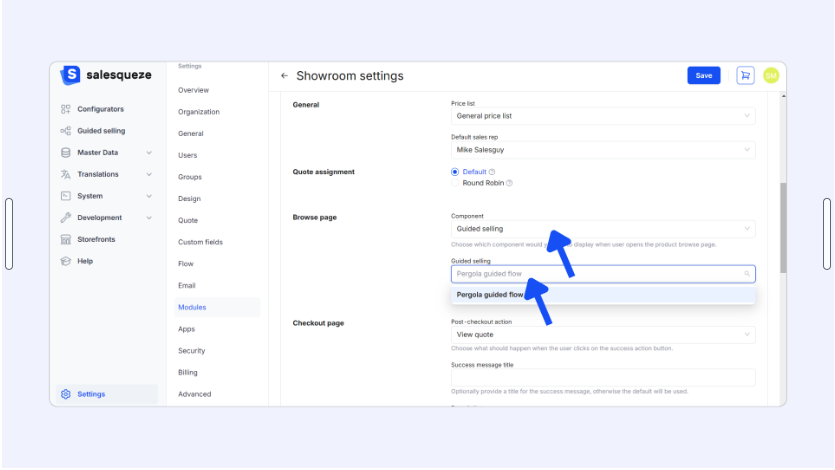
Scroll down to the Browse page settings, then select Guided Selling in the Component dropdown selector. Once you’ve created your Guided Selling flow, you’ll select it in the Guided Selling dropdown selector below.
Creating a Guided Selling flow
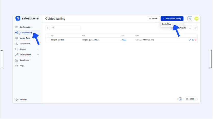
Go to Guided Selling in the left panel of the Studio. Click on the +Add Guided Selling button in the top-right corner of the screen, then select Basic Flow.
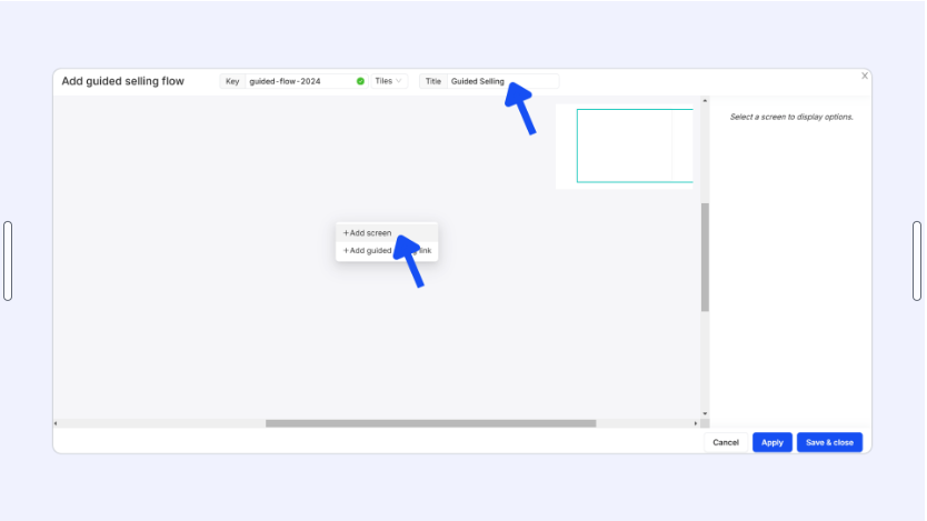
Next, set a Key and Title to the flow.
To start building your flow, right-click anywhere in the gray canvas area, then select +Add Screen.
Screen settings
Each Guided Selling screen represents one of the steps users will go through – though not all users will see every screen.
You can select a screen by clicking on it to display Screen settings in the Toolbox panel.

Here, you’ll give your screen a title and subtitle, add options, and configure its appearance.
Adding options
Each option added to a screen represents a selection that users will be able to make. To add an option, select the screen you want to add the option to, then click on +Add option in the Toolbox panel.
In the Add option modal, give your new option a Title and assign an action. We recommend that you add an image for your option for better clarity. You can also add a summary and description.
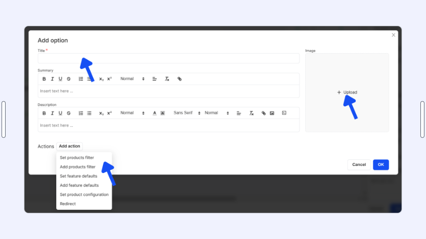
There are six possible actions you can add to each option, and you can add more than one to compound them.
- Set products filter lets you apply a filter that effects what is shown on the next screen when an option is selected; this action overrides any previously applied filters (in earlier screens)
Use case: If you have different product categories or product lines, you can let the customer select a category/product line and filter out all products that don’t correspond to the selection.
- Add product filter lets you apply a filter in addition to previously applied filters
Use case: If you have product subcategories and you are using several steps in your guided selling flow.
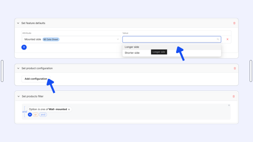
- Set feature defaults lets you apply a default value to the specified features; this action overrides any previously applied feature defaults
Use case: You let the customer set a default value for a feature that is used in multiple product configurators; eg. dimensions.
- Add feature defaults lets you apply a default value to the specified features in addition to previously applied feature defaults
Use case: Feature defaults are added, eg. in addition to previously set dimensions feature defaults, you add feature defaults for garden house layout or a specific add-on.
- Set product configuration allows you to direct a customer to a configurator with preselected product options
Use case: You use a single configurator for multiple variations of your product, and your customers don’t have the technical know-how required to configure the product correctly.
- Redirect lets you send the customer to a custom URL address.
Use case: You have multiple product lines with separate brands and websites.
Screen appearance and layout
You can customize the appearance and layout of each screen using the Card Layout settings in the lower section of the Toolbox.
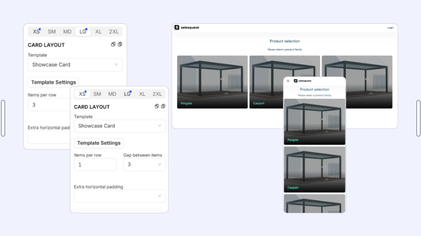
For best user experience, we recommend configuring separate layouts for mobile and desktop users. There are 6 available screen resolutions:
- XS: Mobile, screen size 0 px and more
- SM: Mobile plus, screen size 640 px and more
- MD: Tablet, screen size 768 px and more
- LG: Laptop, screen size 1024 px and more
- XL: Desktop, screen size 1280 px and more
- 2XL: Desktop plus, screen size 1536 px and more
The XS resolution is enabled by default. You can activate additional resolutions by clicking on the relevant tab (eg. MD or XL) and selecting a template (Showcase Card).
Choose how many items you want to display per row and set a gap between items, if you want. You can also add extra horizontal padding.
Template Settings
Click on Template Settings to customize the appearance of your cards and align them with the design of your website and brand.
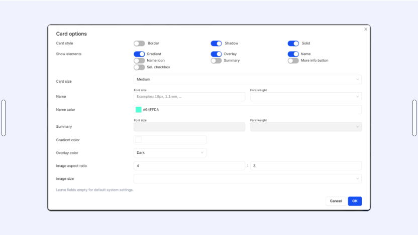
Select a Card style and toggle the elements you want to display on each card. By default, all elements are disabled, which means that only the option’s image appears on the card. You can add elements like a gradient, overlay, name, summary, and button.
Choose a card size and configure font settings for your option name and summary, if enabled in the element picker. You can also set color for your gradient or overlay, if enabled.
You can also set a fixed image aspect ratio and image size. This lets you tidy up your page look and feel, especially if your product images don’t all have the same aspect ratio or size.
Connecting screens
To connect screens, you first need to have created at least two screens and added at least one option to the former screen.
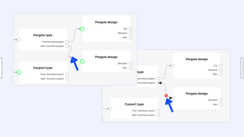
Then, just click on the connector (white circle) next to the option you want to connect, and drag it to the next screen’s connector. An arrow will appear in the canvas area, visually connecting the points together.
To delete a connection, move your cursor over the arrow between two connectors. Click on the red X icon that appears.
Setting an entry point screen
Once you’re finished with your guided selling flow, make sure you set the first screen in your flow as the entry point screen.
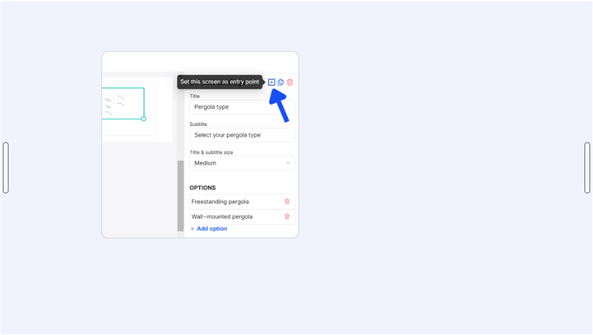
To do this, select the first screen, then just click on the > icon at the top of the Toolbox, next to the Copy and Delete icons.
The entry point screen is marked by a bold green border in the guided selling canvas. Note that the > icon is hidden when the entry point screen is selected.